 |
| The Pink Shell - A Pavilion in Lincoln Park |
Sunday, December 19, 2010
The Pink Shell Revisited
I received some feedback on my work on The Pink Shell pavilion project. While the concept was well received, it was suggested that the images could be higher quality....which is true. Here is another attempt at a better rendering.
Thursday, December 16, 2010
Clearwater - Proposal for an Urban Dialysis Center
 |
| Building from Franklin Street This is Clearwater, a hemodialysis center implemented in a modern building in a dense urban area. As patients with end stage renal disease typically require hemodialysis three to four hours three times per week, I wanted to implement a unit close to home and/or work. In addition, I felt that patients should have the opportunity to use their treatment time to do activities that they might otherwise be doing, such as relaxation, work, or exercise. Evidence shows that patients have less stress and higher satisfaction if they are given choices regarding their care and are provided with positive distractions. In the design of Clearwater, patients have the option of treatment in more open areas with equipment available for exercise or treatment in semiprivate space set up to allow work on a computer. I took advantage of the open floor plates to flood the space with natural light. All treatment areas have a view of a window. Plants are incorporated throughout the space and water elements are present in the lobby garden. As exercise has been shown to have a significant effect on clinical outcomes in patients on dialysis, I allocated two thirds of the treatment area to have the option of exercise during treatment. I also included mobile nursing units to incorporate best safety practices. This gives the nurse constant access to an electronic medical record and the ability to barcode scan all medications at the point of delivery. Both of these practices have been shown to dramatically reduce medical errors. Several issues related to healthcare design impacted my ultimate design. Hemodialysis requires the delivery and drainage of significant amounts of water. Including adequate plumbing stacks required that I abandon my original choice of the historic Inland Steel Building. Instead I designed a new building inspired by the footplate of the Inland Steel and found an alternative location within the Chicago Loop. Aligning the treatment spaces along plumbing walls while maximizing views encouraged me to abandon the idea of an area configured to encourage socialization amongst patients. Material choices were largely based on the need for infection control. I chose sheet rubber flooring and film veneers to minimize seams and to permit easy cleaning. In order to have light passing through the entire space, I chose systems furniture for the office area. Patient exam rooms were walled with smart glass to give privacy. |
 |
| Lobby Atrium - Franklin Street Elevat |
 |
| Lobby |
 |
| Exam Rooms |
 |
| Quiet Treatment Area |
 |
| Treatment Area with Exercise Equipment |
Colors and Selected Materials for Clearwater
 |
| Marathon Advantis Rubber Sheeting American Biltrite |
 |
| Bio Foil LG Hausys |
 |
| My Studio Environment Herman Miller |
 |
| Smart Glass The LTI Group |

Floor Plans for Clearwater
 |
| Proposed Site in Chicago Loop |
 |
| First Floor - Lobby Garden |
 |
| Second Floor - Exam Rooms, Office & Conference Space |
 |
| Third & Fourth Floors - Treatment Areas |
Monday, December 6, 2010
Inhabiting Public Spaces: The Pink Shell

This project part of a graduate interior design theory class called Design & Society. We were to create a design for a public space that would affect how people would interact or use the space. We also had to use the "manifesto" we had developed in a previous theory class or use the manifesto of another designer/architect.

Lincoln Park is a major public space stretching along the lakefront of northern Chicago. It is a place for Chicagoans to meet, exercise, and play. There are multiple structures within the park. Some of them, such as the Chess Pavilion and the Totem Pole, have become iconic landmarks that serve as meeting places for clubs and groups. However, the northern end of the park does not have such a landmark. I propose to implement a new pavilion near the north end of the lakefront path.
Noting that many of the popular Lincoln Park pavilions are located near turns, I selected a site near a fork in the path. The site is near the Bryn Mawr underpass and the Hollywood Beach. While this is a popular area to meet before running or playing volleyball, this is no distinctive landmark to serve as a meeting place. I wanted to create a gathering place that is highly visible from the path, inviting for congregation, and easily “namable.” After exploring a variety of shapes, I chose a shell as an easily recognizable shape that would allude to the beach. Lake Michigan, as fresh water body, does not contain crustaceans that would produce typical seashells, but it is home to a variety of snails with helical shells. I selected a pink hue as reference to the Edgewater Beach Apartments, which are prominent in the northern Chicago skyline, as well as the popularity of Hollywood Beach with the gay community during the summer. I expect that the pavilion will serve not only as a visible meeting place for people before heading off for other activities, but also as a place for locals to “hang out” in the park.

The process of my design was shaped by my Bohemian Manifesto, design informed by Truth, Beauty, Freedom, and Love. As I essentially served as my own client for this project, I took Beauty and Love to be a design of a pavilion that I found aesthetically pleasing and would be a space that I would thoroughly enjoy using. Freedom meant that I would not feel bound to the style or aesthetic of the other pavilions and landmarks in the park. The hardest for me was Truth, maintaining integrity to my original design intent. I had explored multiple shapes, a few of which I was much more excited about from an aesthetic standpoint. However, Truth insisted that I remain faithful to the idea that my pavilion should inspire people to say: “Meet me at the….”


Sunday, November 28, 2010
A new home for my building
Thank goodness for Google Earth. After freaking out about the unsuitability of the Inland Steel Building for my project, I have found a new site for my semester project at the corner of W Randolph and N Franklin. This allows me to remain in the heart of the Loop, which is critical to my concept.
I have created a mirror image of the Inland Steel Building to serve as the pattern for my new building. The views won't be quite as good, but beggars can't be choosers. Also, now that the main core will be part of the design, I will only need to work on the interiors of four floors instead of five. I think that is a good thing....but not sure yet. I am almost caught up to where I was before the meltdown.
Friday, November 26, 2010
Dogs and Impact of Use of Space
Growing up, dogs were a constant presence in my family. However, as an adult, I never thought that I would be able devote enough time to be a responsible dog owner, and I had resigned myself to enjoying the dogs of friends. That all changed four years ago when two little dachshunds entered my life accompanied by my partner. I quickly remembered the extensive level of commitment required by dog ownership in terms of time and money. The payoff comes with the unconditional love and affection.
I set out to study the infrastructure of my dogs’ lives. I planned to examine their routines and habits. I began using digital photography to document their activities in the home and on their walks. In reviewing the photos, I discovered that even more interesting than the patterns of their lives were their impact on our routines and our home. For creatures so small, a significant amount of space is allocated to them. In addition, they have repurposed various elements in the home for their own use. Based on this initial exploration, I decided to shift my focus to looking at how the dogs use and affect our home.
I began to isolate certain areas of obvious impact. The dogs have a kennel as well as a few little beds scattered around on the floor. However, they have a fondness for napping and perching on the big down-filled cushions that form the back of the couches. They leave big dents or “smushes” in the cushions, requiring that we fluff them regularly. All the throw pillows and blankets that we so carefully selected and arranged have been appropriated for their comfort and left in disarray. I desaturated the photos of these areas so I could study the shapes. I then played with the forms by modeling them in Rhino. I also focused on geometries and textures by interpreting some of the shapes in 3D models. I diagramed the daily activities of the dogs and how the home is set up programmatically for them. Using the digital camera, I began to take short videos of the dogs during the activities I had identified in the diagrams.
I used an exercise to represent the collected information as fields in a computer model. Superimposed on a floor plan, I showed the dogs’ functional areas, where they impact the home, and the paths they take through the home. I explored my models through multiple iterations, focusing in on various elements and exploring the point of view of the dogs. In addition, I considered the effect of framing by the camera and the variations exposed by reproduction in different media. This led me to take a few extra videos to document the paths of the dogs through the home at their eye level.
The movie is comprised of video clips of the dogs in their activities, videos of the paths through the home, and still shots of the dogs and their impact on the space. The movie loosely follows the dogs through the day, represented as brief vignettes focused on particular activities. As they spend much of their much of their day sleeping or napping, I wanted to represent the episodic nature of their activity by cutting between videos and still photos. I tried to capture their positive presence in the home with upbeat music, but wherever appropriate I featured the sounds made by the dogs. The movie was compiled and edited in Windows Movie Maker. When necessary, the format of the component media was adjusted using QuickMediaConverter.
In a sense, the process of documentation, experimentation, and movie-making has served as a canine post-occupancy evaluation of the home. When the home was designed, the dogs were certainly taken into consideration. We chose durable textiles for the furniture, selected a hardwood furniture-style kennel, and designed storage areas. In reality, storage for the dogs’ food and supplies takes up about three times as much space as initially anticipated. The way that the dogs use the couches requires that we constantly have to spend time and effort to keep the place looking nice. In addition, dog traffic patterns are very different than human ones, which is not readily apparent until looked at explicitly. From the standpoint of the dogs, it can result in some “near-misses” in terms of clearance under furniture. For the humans, these paths can direct the dogs in ways that put them underfoot unexpectedly.
Thursday, November 25, 2010
A few steps backwards...
I freaked out earlier this week. I met with a dialysis nurse to gain a better sense of how the dialysis machines actually work. Wow....a lot of plumbing is involved. Of course, I knew that from my case study, but it is still a bit overwhelming. I also was thinking about a drug-resistant organism infection rate of about 20%, and she was thinking more like 80%. As I started to thinking about this in the context of the Inland Steel Building and I just couldn't make it work. I started panicking!
I met with my professor on Tuesday to discuss just how the plumbing would have to look to make my ideas work. We confirmed what I suspected...it really cannot work in the Inland Steel Building and maintain the historic design of the building. However, at this point it would be near impossible to start from scratch.
So, I'll be working on the Inland Steel Building, but not. I will reimagining the building as a lower rise building using the same floor plates. I still need for this to be an urban project, so I need to pick a new site for this "new building" in the Chicago loop (looking for empty lots). I then need to review all the work I've done so far in terms of space planning, especially the use and location of the cores. I guess it is better than starting from scratch.
Sunday, November 21, 2010
Putting Research Into Action (sort of)
In Specialization Studio, we are to take what we have learned from our "case study" earlier in the semester and apply it to a design. I had prepared a study, looking at evidence-based design for hemodialysis units. The three factors that seemed most compelling to me were:
- giving patients choices
- opportunity to exercise during dialysis
- positive distractions
Hemodialysis centers are often located in medical centers or in less densely populated areas. I liked the idea of situating one in a dense urban area. As people who require dialysis may need to be there 3-4 hours at a time, 3 times per week, it makes sense to me to locate a center close to wear people work and live. In addition, I wanted to tackle the problem of implementing a complex medical program in a building that is neither a medical building nor new.
Sunday, October 31, 2010
An Analysis of Classical Elements in the London Guarantee and Accident Building

This analysis discusses the classical elements found on the building and analyzes the success of implementing classical design in an early skyscraper.
Thursday, October 14, 2010
Evidence Based Design: Hemodialysis Unit Case Study
Hemodialysis is a medical procedure where the blood is removed from the body and filtered of impurities prior to being returned to the body. Hemodialysis is most commonly used for patients with renal (kidney) failure. While on occasion it is used on a temporary basis for patients with acute renal failure, hemodialysis is frequently used as a long-term treatment for patients with end stage renal disease. Patients receive the treatment multiple times per week. It is required indefinitely unless the patient has a kidney transplant.
Healthcare design has long integrated the principles of evidenced base design. Clearly, many factors can be influenced by design in the healthcare environment. Design can influence the experiences of patients, visitors, clinicians, and staff. Processes, such as waiting times and turnaround times, can be greatly affected by design. Perhaps the most important outcomes that can potentially be improved are clinical variables. The intent of this case study was to evaluate the elements of design that can affect clinical outcomes in an ambulatory hemodialysis center.
The research for this study involved collective information from a variety of sources and then triangulating the data to arrive at conclusions for design solutions. The public health literature was reviewed for statistics regarding end stage renal disease and usage of hemodialysis in the United States. Patient support online chat resources and medical literature were reviewed to delineate issues regarding patient experience. In addition, the medical literature also provided information about important clinical outcomes for hemodialysis. Standard texts in healthcare design provided typical current issues for hemodialysis unit design. The design literature was consulted for information about design elements that can impact patient clinical outcomes.
Hemodialysis units are a common component of the health care system. Given that patients who require hemodialysis will have too many hours at a unit multiple times per week, the opportunity for design to have a cumulative impact on various healthcare outcomes is great. A typical unit is not set up in a manner to allow the patient to have many choices about how to spend time or to be able to socialize. It is not unusual for a patient to spend the four hours of treatment watching television. Based on available evidence, I propose to design a unit addressing these issues. The design would include patient access to environmental controls for each treatment station. The treatment stations will be set up to allow the patient to have visitors during treatment. Patients should have more options during treatment. Areas of the unit will be set aside to allow patients to socialize and to exercise. Based on these interventions, I anticipate that patients at the unit would report a greater quality of life and require less antihypertensive medication. Patients who regularly exercised during the treatment would have improved filtration and ultimately require less time for each individual treatment. While not the direct subject of this case study, these interventions should have positive impact on patient and staff satisfaction as well.
Bibliography
Healthcare design has long integrated the principles of evidenced base design. Clearly, many factors can be influenced by design in the healthcare environment. Design can influence the experiences of patients, visitors, clinicians, and staff. Processes, such as waiting times and turnaround times, can be greatly affected by design. Perhaps the most important outcomes that can potentially be improved are clinical variables. The intent of this case study was to evaluate the elements of design that can affect clinical outcomes in an ambulatory hemodialysis center.
The research for this study involved collective information from a variety of sources and then triangulating the data to arrive at conclusions for design solutions. The public health literature was reviewed for statistics regarding end stage renal disease and usage of hemodialysis in the United States. Patient support online chat resources and medical literature were reviewed to delineate issues regarding patient experience. In addition, the medical literature also provided information about important clinical outcomes for hemodialysis. Standard texts in healthcare design provided typical current issues for hemodialysis unit design. The design literature was consulted for information about design elements that can impact patient clinical outcomes.
Findings:
- The incidence and prevalence of people requiring hemodialysis more than doubled between 1900 and 2004. In 2004, there were 295,000 people requiring hemodialysis, with 88,500 of those being new cases that year.
- In general, a person with end stage renal disease will require hemodialysis three times per week. Each session can be from 3-5 hours duration. Upon arrival, the patient will be weighed and have blood drawn. This determines the current fluid and electrolyte balance, influencing the duration and parameters of the daily treatment. The patient is then placed in a recliner chair and hooked up to the dialysis machine. Access to the vascular system is either through a catheter or through an arterio-venous fistula implanted in the forearm. If a fistula is used, the patient will have limited use of that arm during the treatment. During the treatment, the nurse will monitor the patient’s vital signs and the settings on the machine. On some occasions, the patient may meet with the physician, dietitian, or social worker during or after the treatment. Following treatment, the patient is weighed again before leaving.
- Hemodialysis units can vary greatly in size based on the number of treatment stations. Each patient treatment station requires a minimum of 80 square feet. In addition, space will be required for reception, nursing station, preparation and storage of dialysis materials and medications, patient education/counseling, and laboratory. Special areas of particular concern for a hemodialysis unit are patient privacy, infection control, and plumbing.
- Patients generally do not consider hemodialysis to be a good experience, especially initially. They report feeling tired and sometimes ill during the treatment. They also report a sense of social isolation and boredom. Patient satisfaction has been found to have strong influence on levels of staff burnout. Staff satisfaction was influenced by access to information, professional accomplishment, and patient satisfaction.
- A wide variety of clinical outcomes are regularly followed in hemodialysis units, including adequacy of filtration, serum albumin (protein) levels, fistula use, metabolic bone disease, hospitalization rates, blood pressure, and mortality rates.
- In a variety of hospital settings, design interventions have been shown to reduce stress and blood pressure. These design elements include giving the patient sense of control, access to support, positive distractions (e.g. nature), and lack of negative distractions (e.g. television). Exercise during hemodialysis has been shown to improve filtration, improve sense of quality of life, and reduce requirement for antihypertensive medication.
Hemodialysis units are a common component of the health care system. Given that patients who require hemodialysis will have too many hours at a unit multiple times per week, the opportunity for design to have a cumulative impact on various healthcare outcomes is great. A typical unit is not set up in a manner to allow the patient to have many choices about how to spend time or to be able to socialize. It is not unusual for a patient to spend the four hours of treatment watching television. Based on available evidence, I propose to design a unit addressing these issues. The design would include patient access to environmental controls for each treatment station. The treatment stations will be set up to allow the patient to have visitors during treatment. Patients should have more options during treatment. Areas of the unit will be set aside to allow patients to socialize and to exercise. Based on these interventions, I anticipate that patients at the unit would report a greater quality of life and require less antihypertensive medication. Patients who regularly exercised during the treatment would have improved filtration and ultimately require less time for each individual treatment. While not the direct subject of this case study, these interventions should have positive impact on patient and staff satisfaction as well.
Argentero, Piergiorgio, Bianca Dell'Olivo, and Maria Santa Ferretti. Staff Burnout and Patient Satisfaction With the Quality of Dialysis Care. American Journal of Kidney Diseases, 2008: 80-92.
Clinical Outcomes. http://www.davita.com/incenterhemo/clinicaloutcomes/ (accessed online: October 2010).
Daul, A. E., R. F. Schafers, K. Daul, and T. Philipp. Exercise During Hemodialysis. Clinical Nephrology, 2004: accessed online.
Himmelfarb, Jonathan, Arnold Berns, Lynda Szczech, and Donald Wesson. Cost, Quality, and Value: The Changing Political Economy of Dialysis Care. Journal of the American Society of Nephrology, 2007: 2021-2027.
Kidney Patient Guide. http://www.kidneypatientguide.org.uk/site/PStory.php (accessed online: October 2010).
Skaggs, Ronald L. Ancillary Departments. В Building Type Basics for Healthcare Facilities, editted by Stephen A. Kliment, 132-136. Hoboken: John Wiley & Sons, Inc., 2008.
Ulrich, Roger S. Effects of Interior Design on Wellness: Theory and Recent Scientific Research. Journal of Healthcare Interior Design, 1991: 97-109.
Wednesday, October 13, 2010
Tiffany Lamp Shades
The Hanging Head Dragonfly Shade on Mosaic and Turtleback Base is a 2006 addition to the decorative arts collection at the Art Institute of Chicago. Tiffany Studios produced this particular lamp sometime prior to 1906. The lampshade is stamped “TIFFANY STUDIOS NEW YORK 1507” corresponding to model 1507. The bas is stamped “TIFFANY STUDIOS NEW YORK 5858” corresponding to model 355. Prior to its acquisition by the Art Institute of Chicago, it was owned by Mrs. Sandra van den Broek and Mr. Jeffrey C. Thier.

The list of Tiffany lampshades and bases around this time was extensive. For many of the lamps, the base and the lampshade were designed to complement one another and ultimately to be sold as a pair. This was particularly true for most of the florally inspired designs, where the lampshade was in the shape of a blossom with the base being the corresponding stem. However, catalogs listed the shades and bases separately, with over 500 lamp base designs and over 500 lampshade designs available.[1] Tiffany first introduced electric lamps in 1900. When the electric lamps replaced the earlier gas lamps, some of the prior base designs were converted to accommodate the new technology. New designs, however, took advantage of the fact that there no longer needed to be a repository for the oil. The bases became more graceful and elongated, well suited to the Art Nouveau style.[2]
Louis Comfort Tiffany started as a fine artist, and enjoyed some success as an oil and watercolor painter. He transitioned his career into interior design and decorative arts.[3] Later, he found himself drawn to glass, attracted to the craftsmanship required for the production of fine glass. However, he felt that the techniques used to color glass detracted from its beauty. After some initial experiments in a rented studio, Tiffany entered into a series of partnerships in the mid to late 19th century.[4] He sought to determine the formula and technique for producing high quality glass where the color was integral to the substance of the glass. He decided that he needed his own plant and studio, and in 1892 he started his own company with Arthur Nash in Corona, New York. Tiffany was the creative partner, both directing design and pushing the effort to develop the new process for creating colored glass. Arthur Nash, with extensive experience in producing glass, oversaw the operations and quality in the plant. It was Nash who carefully cataloged and guarded the formulae for the different colors and styles of glass.[5]
The studio’s basic process of glass production did not differ significantly from what was being done at that time. While the specific formulae varied, silica was melted with other substances, typically soda and lime, in a furnace. The molten glass was extracted and shaped using a variety of techniques, including blowing, rolling, and pressing. A secondary furnace, called a glory hole, was used to reheat the glass so that it did not harden prematurely while being shaped. After shaping, the glass slowly cooled, a process called annealing, in a lehr, a lower temperature oven.[6]
The main factor differentiating Tiffany’s glass from other glass at that time was his process for incorporating color. Most glass was colored by enameling or painting on the surface. Tiffany felt that true craftsmanship lay in adding color during the production of the glass, so that the color was inside the glass, not on the surface. Metal salts were either melted in with the molten glass or vaporized in a furnace, into which the partial cooled glass was inserted.[7] Different techniques were used to achieve affects such as striation and rippling in the color. Depending on the formula, the process could also produce opalescence or iridescence, which was characteristic of favrile glass. ‘Favrile’ is generally taken to mean glass produced by the studios of Louis Comfort Tiffany. Tiffany coined the word ‘favrile’ in 1894, deriving it from an old English word ‘fabrile’ meaning handmade.[8] Tiffany was a strong proponent of the tenets of the design reform, believing in highlighting the quality of materials and demonstrating outstanding artisanship. He described all of his work as favrile. Today, favrile refers almost exclusively to Tiffany glass, and more specifically to the iridescent glass.

Tiffany glass was also notable for its textures. For the flat glass used in lampshades, tools were used to create rippled, hammered, and drapery effects.[9] Glass was also poured into molds and then pressed to give distinctive shapes. After the final cooling, these could be further polished or cut to create facets. One such pressed form for which Tiffany was well known was the turtleback shape, resembling the shell of a turtle.[10] Smaller turtleback tiles were incorporated into the design of some lampshades. A few lampshades were made entirely of larger turtleback tiles. Alternately, larger turtleback tiles were sometimes incorporated into a lamp base.
 The process of designing and assembling the lampshades drew on the Tiffany’s experience with stained glass windows. The lampshades were essentially leaded-glass windows, though the leading in Tiffany’s designs was more typically copper foil with lead solder. A design would be selected by a client from a catalog, or a custom lampshade could be designed to specification. Artisans in the studio would mold the design for a lampshade over wooden forms. While the basic design for a particular shade would be reused multiple times, each individual shade was unique because of the variation of the glass. The workers assembling the shades would hand select each fragment of glass. The process of selecting and coordinating colors was dynamic and occurred at the time of assembly.[11] Careful consideration was given not only to the hue of the tiles but also the opacity. These factors would influence the amount and nature of light from the lamp.
 Clara Driscoll headed the Women’s Glass Cutting Department, responsible for cutting, selecting, and assembling the glass for the shades. In addition, Driscoll was largely responsible for most of the floral designs. Her counterpart leading the men’s department, Mr. Cantrill, was responsible for the more geometric designs.[12] By 1900, Tiffany had adopted a policy of collaborative corporate effort, where individual designers did not receive credit for specific designs. As the head of the studio, Tiffany had direction of all artistic direction and likely approved most if not all designs. However, there is clear evidence that Driscoll designed the original dragonfly lampshade, as well as evidence suggesting that she was responsible for many subsequent designs. The dragonfly motif was first included in a lampshade at the end of the 19th century. Tiffany lamps were introduced at an exhibition of the Art Nouveau at the Grafton Galleries in London. In the exhibition publication by Tiffany, design of the 16-inch dragonfly shade was credited to Clara Driscoll explicitly.[13]
 Louis Comfort Tiffany was a significant figure in the Art Nouveau period in the United States. He clearly embraced the design reform. He spent years developing techniques to allow beauty of the material of his glass be the dominant feature of his design. His dedication to the concept of hand artisanship was so profound that he even coined the word “favrile” to brand his approach. Even when economic realities necessitated that parts of his process be mechanized, the ultimate products were assembled by hand. The lamps received instant critical acclaim when they were introduced, winning top awards at international expositions in Paris and Turin.[14] Siegfried Bing featured Tiffany lamps in L’Art Nouveau, his Paris gallery.[15] The popularity of the designs remains popular today. Antique enthusiasts catalog the various permutations of lampshades and bases and excitedly seek to authenticate when a previously unknown instance surfaces in an estate. The Hanging Head Dragonfly Shade on Mosaic and Turtleback Base is a dramatic example of the genre. With the natural motif of the dragonfly, the styling is distinctly Art Nouveau. The lampshade features a variety of glass segments, including opalescent favrile glass and jewel like cabochons. The dragonfly wings are particularly noteworthy, with fine copper foil delineating minute fragments of glass. Unlike many of the other bases, this base is more geometric and prominently features more glass. Large turtleback tiles surround the base immediately beneath the shade. The sides of base are covered with strips composed of glass mosaic tiles).
Tiffany lamps remain a success because of both the design and the craftsmanship. While clearly a product of the Art Nouveau, the integration of lampshade and base and the use of harmonious colors make the designs enduringly popular. Particularly impressive is the success of the craft. Tiffany invested years developing a technique to showcase the beauty of glass. A century later, the vibrancy and quality of his glass is still readily apparent. He was not the first to develop opalescence and iridescence in glass, and he was extensive imitated both during his time and since. However, his glass has remained one of the defining examples of American stained glass.
[1] Robert Koch, Louis C. Tiffany’s Glass-Bronzes-Lamps, a Complete Collector’s Guide (New York: Crown, 1971), 119.
[2] Alastair Duncan, Tiffany Lamps and Metalware, an illustrated reference to over 2000 models (Woodbridge: Antique Collectors’ Club, 2007), 53.
[3] Alice Cooney Frelinghuysen, "Louis Comfort Tiffany at The Metropolitan Museum of Art." The Metropolitan Museum of Art Bulletin, Summer (1998), 4-17.
[4] Norman Potter and Douglas Jackson. Tiffany ( London: Pyramid, 1988), 32-34.
[5] Nina Gray “Glass of All Hues and Colors,” in Tiffany Glass, a Passion for Colour, ed. Rosalind M. Pepall (Montreal: The Montreal Museum of Fine Arts, 2009), 106-108.
[6] Koch, Tiffany’s Glass-Bronzes-Lamps, 52-55.
[7] Potter and Jackson, Tiffany, 34-47.
[8] Koch, Tiffany’s Glass-Bronzes-Lamps, 17-19.
[9] Gray, “Glass of All Hues,” 108-111.
[10] Koch, Tiffany’s Glass-Bronzes-Lamps, 27-28.
[11] Frelinghuysen, “Louis Comfort Tiffany,” 69-72.
[12] Martin Eidelberg, “Tiffany’s Lamps and ‘Fancy Goods,’” in Tiffany Glass, a Passion for Colour, ed. Rosalind M. Pepall (Montreal: The Montreal Museum of Fine Arts, 2009), 166.
[13] Duncan, Tiffany Lamps, 7-9.
[14] Potter and Jackson, Tiffany, 84-88.
[15] Frelinghuysen, “Louis Comfort Tiffany,” 72.
Bibliography
Bing, Samuel. "Louis C. Tiffany's Coloured Glass Work." Artistic America, Tiffany Glass, and Art Nouveau. Cambridge, MA: MIT Press, 1970.
Duncan, Alastair. Tiffany Lamps and Metalware, an illustrated reference to over 2000 models.Woodbridge, Suffolk: Antique Colelctors Club, Ltd., 2007.
Eidelberg, Martin. "Tiffany's Lamps and 'Fancy Goods'." In Tiffany Glass, a Passion for Colour, edited by Rosalind M. Pepall, 164-199. Montreal: The Montreal Museum of Fine Arts, 2009.
Frelinghuysen, Alice Cooney. "Louis Comfort Tiffany at The Metropolitan Museum of Art." The Metropolitan Museum of Art Bulletin, Summer 1998.
Gray, Nina. "Glass of All Hues and Colors." In Tiffany Glass, a Passion for Colour, edited by Rosalind M. Pepall, 106-113. Montreal: The Montreal Museum of Fine Arts, 2009.
Koch, Robert. Louis C. Tiffany's Glass-Bronzes-Lamps, a Complete Collector's Guide. New York: Crown Publishers, 1971.
Potter, Norman, and Douglas Jackson. Tiffany. London: Pyramid, 1988.
Sunday, October 10, 2010
Piazza d'Italia: A Paradigm Shift Away From Modernism
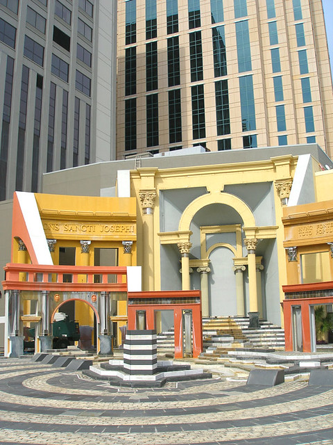 |
| source: perfectsnap on flickr |
The Piazza d’Italia was designed by Charles Moore in conjunction with New Orleans based Perez Architects. The plaza was commissioned to recognize the contributions of Italian culture in New Orleans. The plaza was part of a larger plan to rejuvenate part of the warehouse district. Perez Architects created infill buildings along Tchoupitoulas Street, assisting with the rehabilitation of historic buildings on the block. The Piazza d’Italia was placed behind these buildings, in the center of the block. It was to be an unexpected plaza, like the squares in Europe that open up from a narrow road or alley. Built from 1975 – 1979, the Piazza d’Italia fell almost immediately into disuse and disrepair. Partial renovations were done in 2004 in conjunction with the opening of the adjacent Loews Hotel.
In design, the Piazza d’Italia and Charles Moore are firmly associated with Postmodernism. At least into the 1950s, the Modern movement was the dominant theory in design. Architects such as Robert Venturi and Charles Moore pushed against Modernism, feeling that it defined what design should be and excluding everything that did not fall within that definition. Postmodernism rejected absolute distinctions, strict definitions, and restrictive rules. Moore in particular was concerned about what was excluded by Modernism. He preferred to consider what could be included by design, not excluded. In this light, Postmodernism embraced the ornament and historical architecture that had been explicitly rejected by Modernism.
Even in a field of architects rejecting the dominant Modernist paradigm, Moore stood out with designs that ranged from whimsical to flamboyant, including projects such as Sea Ranch, the UCSB Faculty Club, and Kresge College at UCSC. The Piazza d’Italia does not represent the initiating project in Postmodernism, but rather it is one of the prominent defining moments in the rejection of Modernism. Even though some of Moore’s original design was rejected as being too tacky, the final project was a vivacious compilation of classical Roman references with contemporary materials and methods. Not only was the Piazza ornamented, it appeared to be build of ornament. Lacking any sense of massing, the space reads more as an event than a built form. Much of previous Postmodern work, even Moore’s projects, had involved adding various elements to buildings to create an architecture of inclusion. The Piazza d’Italia could be regarded as the endpoint of that process, rejecting all elements of Modernism.
The Piazza d’Italia was both acclaimed and reviled by critics. Ten years later, Charles Moore acknowledged both his supporters and detractors, feeling that both the amount and ferocity of the debate indicated the importance of the subject. This is the essence of the paradigm shift initiated by Postmodernism. With its use of historical elements and ornament in a distorted or playful way, Postmodernism resembles a Mannerist style more than a defined movement. Its exaggerated approach demands response and invites discussion. This shift has had an enduring impact in architecture. While Modernism has not completely gone away, it no longer has the prescriptive power it once had. However, no one movement has secured the dominant position previously held by Modernism. Postmodernism had similar effects in a variety of disciplines, from literature to gender theory. As an example of the interrelated influences of design and society, architectural design embraced greater plurality in parallel to a movement towards more diversity in society.
Wednesday, October 6, 2010
Blogging Reboot
While I have been dabbling with blogging for a while, I don't feel that I had any particular direction. The entries were more of a chore or simply for cataloging. I certainly haven't had much coherence in entries. Recently, I have been experimenting on different platforms and came to realize that perhaps I wasn't thinking of blogging correctly. I was trying to figure out how to have one blog fit all my needs. There was no way to make that work.
I will be keeping four blogs in some fashion or another moving forward:
In Many Worlds - will be my personal blog. I want to explore how I maintain balance as I maintain my responsibilities at work, in school, and in life. I will be including some reflective pieces as well as more current musings.
Daydreaming About Space - will serve as a log for my school work. I want to catch my process and my drafts, as well as thoughts about my education.
reVisioned - will be used to report what is capturing my interest. I foresee posting links and media, sometimes with short commentary. This blog will feed into Twitter, and some of the posts will make their way into my other blogs.
Designing Wellness - is going to be my more 'professional' blog. I have set up my own domain to self-host this blog. I want to explore and share my insights on healthcare design, the intersections of hospitality and healthcare, and evidence-based design. I am particularly impact on the affect of design on clinical outcomes, experience of stakeholders, and healthcare systems.
I am sure there will be evolution of all these blogs as time goes on. Honestly, I hope I haven't taken on more than I can handle. Regardless, the experience will be rewarding.
Wednesday, August 4, 2010
Even Shorter Dog Video
I'm approaching 4 minutes....and the transitions are much smoother. For some reason, the editing was much easier this time....wish I knew what I was doing different. Check out the funky Brazilian music from Zuco 103....LOVE IT!
Dog Movie 10 0803 from Aaron Gilbert on Vimeo.
Dog Movie 10 0803 from Aaron Gilbert on Vimeo.
Wednesday, July 28, 2010
Shortened Dog Video
Significant edit....now less than 5 minutes. The transitions are still rough....and I am thinking about trying to edit it down further. I definitely consider this a draft.....
Dog Movie 10 0727 from Aaron Gilbert on Vimeo.
Model for Transmedia Strategy
I continue to envision my transmedia strategy as a cloud....shifting, permeable.......encompassing multiple ideas. Some ideas are larger, and will bud off into other ideas. Some are smaller and stand on their own.
Tuesday, July 20, 2010
reVision-ing
I am working on a project for class with focus on communicating in a magazine and developing a brand image. I see my work as a designing as 'revisioning'....seeing new possibilities, reviewing, and constant revisiting and editing of work. It links closely with my affinity towards dreaming and daydreaming.
I am going to explore various topics over three issues of reVision. One issue will use my work from the dog video, considering how dogs use a space as opposed to humans. Another issue will be a vehicle for exploring my ideas for my eventual thesis, considering other options for people requiring dialysis as they travel. Finally, I will be revisiting the work I have been doing in school, creating a mini-portfolio of sorts.
The first draft covers:


Tuesday, July 6, 2010
final banners
A big thanks to my classmates Leslie and Manuel who were so generous with their time, giving feedback on multiple iterations of the weekend. I sent the banner to the print shop last night. Yay!


Wednesday, June 30, 2010


Subscribe to:
Posts (Atom)